Microsoft Fixed the NuGet Package Manager with the Version 3.3
Jürgen Gutsch - 02 December, 2015
In the summer this year the NuGet Package Manager got an update, which changes the UI completely. This new UI wasn't really intuitive to use and confuses many users.
With the Update 1 of Visual Studio 2015 MIcrosoft also delivers an update of the NuGet Package Manager. Now the UI is pretty much cleaner and easier to understand. There are still some things to do, but if you compare to the previews UI this is much better.
The first thing you will see are the new tabs in the left upper area. Here you can change the list to browse all or all found packages, you can view the installed packages and now you have a clean list of the packages which have new versions available:
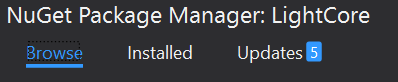
As you can see, there are the number of updates shown in the third tab. Also the selection of the package source is easily done in the right upper area, where you also able to access the NuGet option:

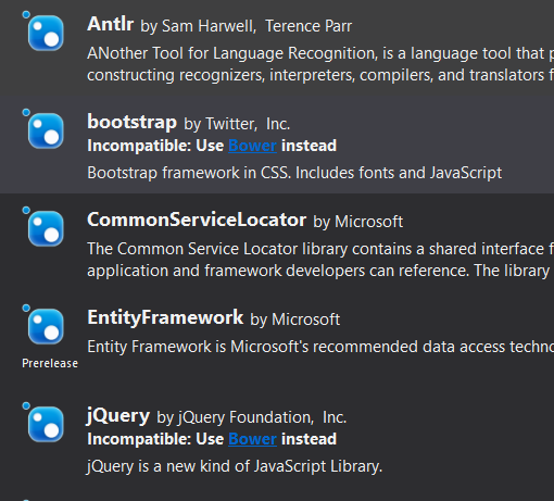
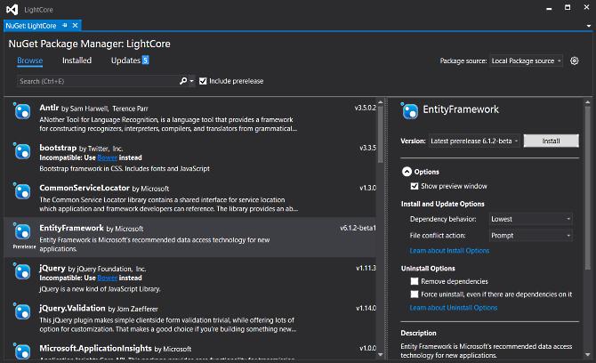
If you take a look at the package list, there is another pretty cool feature. If there is a package found which delivers exactly the same thing as an Bower package does, you will see a small message with a link in it. This message tells you that you should use Bower to install this package. The link opens up the new Bower package manager. Bower is the cool package manager which should be used to add client side libraries to web projects:
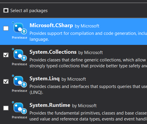
If you go the updates by clicking the Updates tab, you'll see another nice thing. Now you can update as many packages as you want. You can use a checkbox on the left side of each package to select the packages you want to install. In the past it only was possible to update one or all packages:
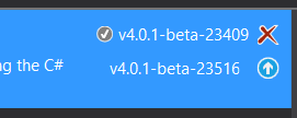
On the right side of each package in that list, Microsoft added one to two action buttons to quick do something with that package. Depending on which tab you are. You can quick install in the "Browse" tab, quick uninstall on the "Installed" tab or both uninstall or update on the "Updates" tab:
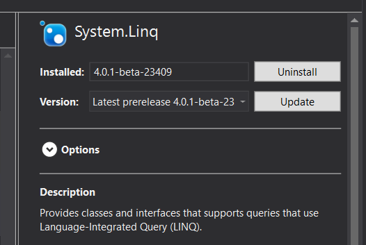
The NuGet Package Manager is divided into three areas: The heading area with the tabs, the search, the package sources, a list area on the left with the list of packages and its action buttons and a kind of a summary area on the right where you will see actions and summary information about the currently selected package. The actions are completely are more detailed as with the action buttons in the list. E. g. you are able to update to a specific version, instead of the latest version only. You will see the dependencies, project and license links, descriptions and so on.
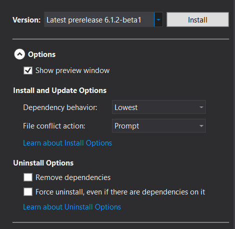
The only thing what is not really on the right place are the options in the summary area. This is wrong because this options are not specific to the selected package, but some more global. From my perspective this options should be moved to the options dialog:
What do you thing? Update your Visual Studio to Update 1 and tell me your opinion about the new UI of the NuGet Package Manager.
I'm very happy about this changes, even if I use this tool less than before, because to project.json files in DNX libraries are more comfortable from my point of view. ;)
By the way: There is a much more detailed blog post about the new Package Manager and many more new features available on http://blog.nuget.org/20151118/nuget-3.3.html